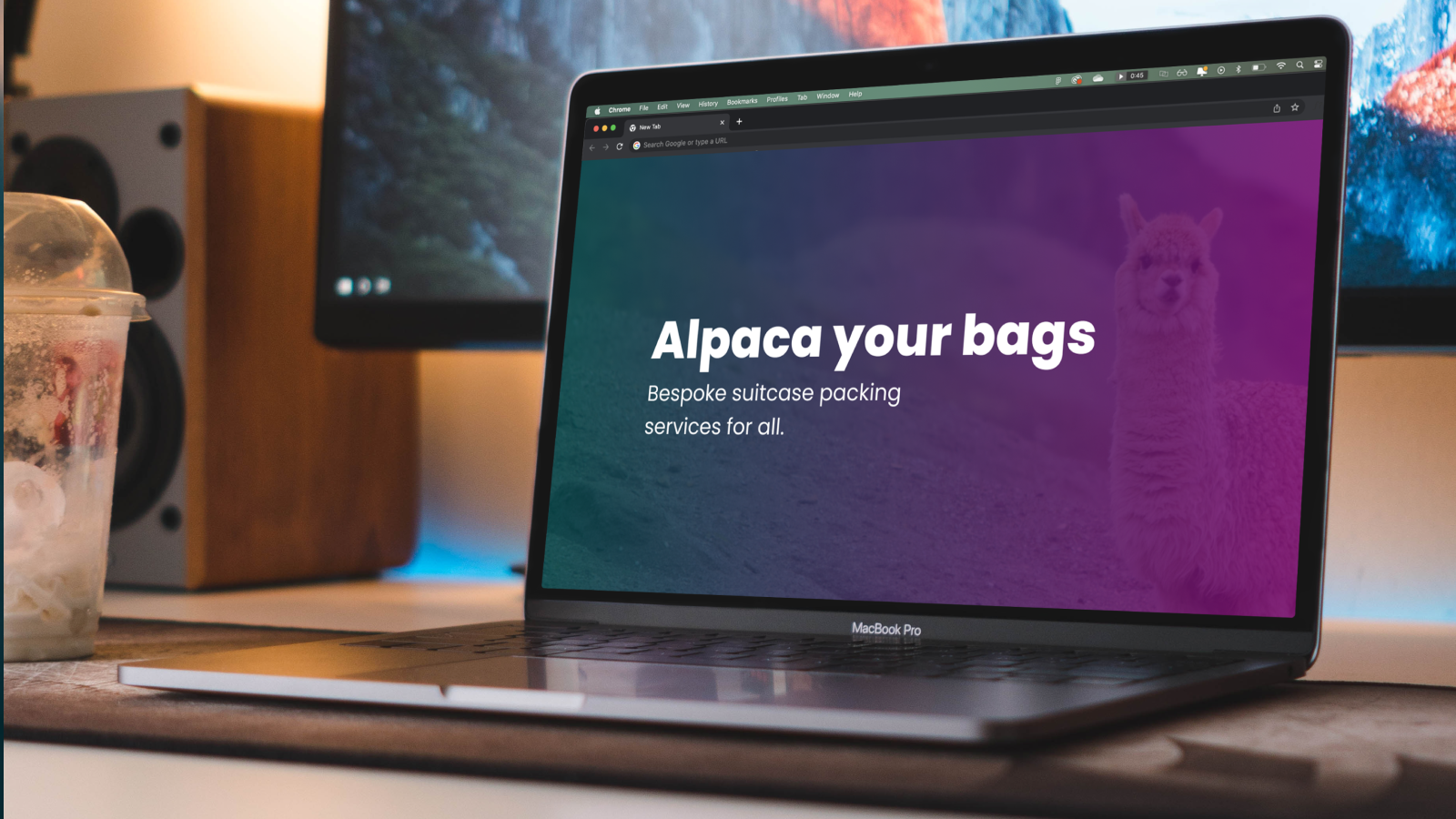
Here’s why your website should be as unique as you
Pick any industry out of a hat and go to the first 20 websites you find. I’m willing to bet they all say things like: “We’re innovative”, “We’re dynamic”, “We provide bespoke solutions”. Yawn. How original…
And then you scroll through their website, and it looks exactly the same as every other one you’ve been on. With the same blocky page structure, the same uninspiring stock images, and the same bog-standard customer journey.
Let’s not get it twisted here. Your website is an investment, and investments are supposed to make you more money. That’s exactly what a bespoke website build is (literally) designed to do.
The fact is, most people who visit your website for the first time aren’t ready to buy there and then. They’ll need to do their due diligence first, snoop around, check out your reviews, ask their friends and colleagues what they think. Then, if all those stars align, they’ll come back to get in touch with you.
Now imagine this: you’re a customer looking for a service. You’ve been on 5 different sites and now you’re ready to buy. Which website are you going to go back to and buy from?
Chances are it’s going to be the one that was the most memorable. I’m sorry to disappoint you, but if your website looks, navigates and communicates the exact same way as your closest 3 competitors, then it’s highly unlikely you’re going to be front of mind for that person when they’ve got their credit card in their hand.
Standing out is a superpower, and a bespoke web build is one of the best ways you can do that.
“Yeah, but I bet a bespoke build costs a bomb though!”
Not necessarily. Don’t get me wrong, if you’re asking us to build “the next eBay”, then you’re quite right that 5 gold doubloons and a Freddo probably isn’t going to cut it. But if you’re looking for a website that still does the job, but actually stands out from all the vanilla ones in your industry, then a bespoke build could actually be much easier on the wallet than you might think.
It’s not about attaching every bell and whistle you can find and trying to overproduce and oversell what you do. Nobody likes a try-hard, especially if it doesn’t fit in with who you are as a business. The real skill lies in smart design and subtle changes that are designed to have the maximum impact on your buyer’s mind.
Ok, so what actually goes into building a bespoke website?
Much like building a house, you don’t just grab some bricks and start piling them up hoping for the best. You need a clear strategy in place before a single word or piece of code is written. That means having a deep understanding of who you are targeting, how they like to be spoken to, and how they behave online when buying things. We’ll help you figure this out by delving into your existing and previous data, and analysing your closest competitors to find opportunities for you to truly stand out from the crowd.
Once you know exactly who you want to speak to, it’s time to make them listen. All good sites are built on the foundation of engaging and impactful copy. Your site could look a million dollars, but if the copy reads like Gordon Brown doing the shipping forecast, I can guarantee that those customers won’t be breaking down the door to hand you their hard-earned cash. Start with your copy first. Always.
After that, it’s time to drill down into the visuals and bring this baby to life. You’ll hopefully have a set of brand guidelines created that we can work from to ensure that every single paragraph, asset, icon, colour and font remains consistent throughout your website. If you don’t have those, we can help you with that, too. Just ask.
The goal of any decent website is to take your customer on a journey:
- Introduce yourself and explain how you can help people like them.
- Tell them why they should choose you instead of one of your competitors.
- Show them who else has chosen you and how you helped them.
- Give them all the ways they can contact you to get the ball rolling.
It really is that simple. Yet if your customer journey is clunky, the call-to-actions aren’t clear enough, or you aren’t putting the right information in the right places, then you’re going to lose customers at each stage of that journey.
Having expert designers and developers on hand means you can create a website experience that not only looks incredible, but also converts. Because, let’s be honest, that’s the whole point. Your website should be a salesperson that never sleeps.
Oh, and whilst we’re talking about visuals, please stop using stock images that have no relation to what you do. Every time a terrible stock image is used on a website, a puppy dies. Customers want authenticity, not a group of models laughing maniacally into an Excel spreadsheet. It looks creepy and weird. You’re welcome.
We’re lucky to have an expert team of photographers, videographers and illustrators that can capture all the best parts of your business and display them in the most effective way to blow the socks off any potential client. It’s honestly one of the easiest ways to give your potential customers that instant emotional connection with you and your business. And, as we all know, people buy from people.
This all sounds great, but I’m a startup. Is Wix & Squarespace really that bad?
Of course not. We all have to start somewhere, and it’s great that these platforms exist now to give people a DIY experience of building their own websites. But it’s horses for courses.
These types of websites are fine if you just want to have some basic information on a basic landing page to show that you are a legitimate business and not a dodgy Russian arms dealer. But particularly if you’re aiming to sell high value products or services, then your website needs to reflect this.
You could be the very best in the world at what you do, but if a customer finds your website and decides that it looks amateur, you’ll never even know about it. They’ll just leave and use someone else.
So, whilst these DIY platforms do serve a purpose, your website should evolve and develop at the same pace that your business and your brand does. Choosing a bespoke website means you’re getting the expertise of designers, developers, copywriters, photographers, illustrators and strategists all under one roof.
All that experience means you’re going to end up with a final product that gives you the very best chance of landing those ideal clients you’ve been dreaming about for the last few months.
Ok, I’m interested. What are the next steps?
Easy. Get in touch and one of our team will help make your vision a reality. In the meantime, why not check out some of the testimonials from our other happy clients.
Until next time, folks.


